Pathostheatre News
Mapping the COVID-19 Landscape: An In-Depth Analysis of Current Trends
As the world continues to navigate the complexities of the COVID-19 pandemic, understanding the geographical distribution and trends of the virus remains crucial. Utilizing comprehensive COVID maps provides valuable insights into regional case numbers, test positivity rates, and vaccination coverage. This article delves into the current state of COVID-19, emphasizing the importance of these maps in public health decision-making.

The Role of COVID Maps in Tracking the Pandemic
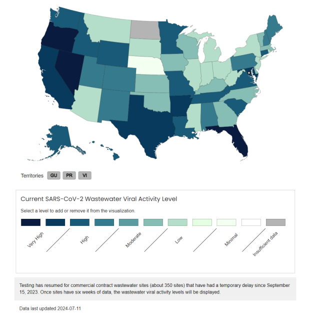
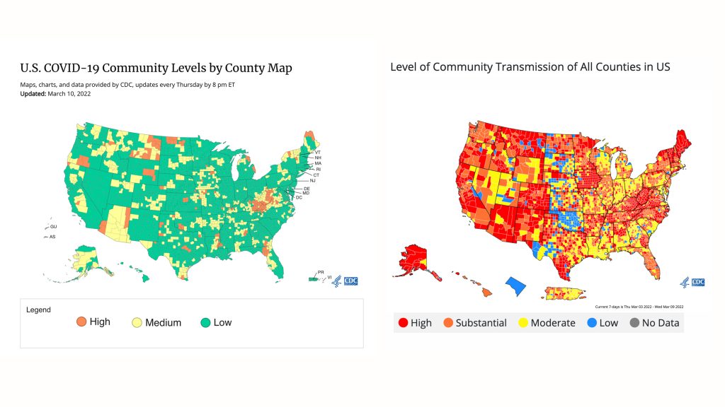
COVID maps have been instrumental in visualizing the spread of the virus since its onset. They offer a spatial representation of data, allowing for the identification of hotspots and trends over time. Organizations like the World Health Organization (WHO) and the Centers for Disease Control and Prevention (CDC) have developed interactive dashboards that display real-time data on cases, deaths, and vaccinations. These tools are essential for policymakers, health professionals, and the public to make informed decisions regarding travel, healthcare resource allocation, and implementation of preventive measures.
Current Global COVID-19 Trends
As of December 2024, global COVID-19 cases have shown varying trends across different regions. According to the WHO COVID-19 Dashboard, certain areas are experiencing declines in cases, while others face resurgences due to factors like new variants and vaccination rates. For instance, some countries have reported increased cases attributed to the emergence of new variants, underscoring the need for continuous monitoring and adaptation of public health strategies.

United States COVID-19 Overview
In the United States, the CDC’s COVID Data Tracker provides detailed maps illustrating test positivity rates, hospitalizations, and deaths. As of late November 2024, the national test positivity rate varied across regions, with some areas reporting rates as high as 6.3%. Hospitalization rates stood at 1.6 per 100,000 population for the week ending November 9, 2024, indicating a slight decrease from the previous week. These metrics are crucial for assessing the burden on healthcare systems and guiding public health interventions.
Importance of Test Positivity Rates
Test positivity rates, representing the percentage of all coronavirus tests performed that are actually positive, are a key indicator of COVID-19 transmission levels in a community. High positivity rates may suggest that testing is limited to individuals with severe symptoms, potentially missing mild or asymptomatic cases. Conversely, lower positivity rates can indicate more widespread testing and better control of the virus’s spread. Monitoring these rates helps in understanding the adequacy of testing efforts and the level of virus transmission.
Utilizing COVID Maps for Public Health Decisions
COVID maps are not only tools for visualization but also serve as critical instruments for public health planning and response. They assist in identifying areas with rising cases, enabling targeted interventions such as localized lockdowns, increased testing, and vaccination campaigns. Moreover, these maps facilitate the allocation of medical resources to regions most in need, ensuring a more effective and efficient response to the pandemic.
In conclusion, COVID maps play a pivotal role in understanding and combating the pandemic. They provide a clear picture of the virus’s spread, inform public health strategies, and ultimately contribute to saving lives. Staying informed through reliable sources and regularly consulting these maps empowers individuals and communities to make decisions that protect public health.
Frequently Asked Questions
Q1: What is a COVID map?
A COVID map is a visual representation that displays data related to COVID-19, such as case numbers, test positivity rates, and vaccination coverage, across different geographical regions.
Q2: How can I access reliable COVID maps?
Reputable organizations like the World Health Organization and the Centers for Disease Control and Prevention offer interactive COVID maps on their official websites.
Q3: Why are test positivity rates important?
Test positivity rates help determine the level of COVID-19 transmission in a community and assess the adequacy of testing efforts.
Q4: How do COVID maps assist in public health decision-making?
COVID maps identify hotspots and trends, enabling targeted interventions and efficient allocation of healthcare resources.
Q5: Are COVID maps updated regularly?
Yes, organizations like the WHO and CDC update their COVID maps regularly to reflect the most current data available.
Q6: Can individuals use COVID maps to make personal decisions?
Absolutely. COVID maps provide valuable information that can guide personal decisions regarding travel, social interactions, and adherence to preventive measures.
From Pathostheatre


